Introduction
This post shows how to create a login system using App Inventor. The objective of the post is twofold: on the one side to provide the sources of a working template that can be reused in further applications, and on the other side to explain the fundamentals of its development.
You may be interested in this template if you intend to develop an app that requires the user to identify himself. This is useful for example in a game where you want to record the results and provide a classification of best scorers, or in general whenever you intend to enhance the user experience by tracking its history and remembering some of its decisions about configuration, look&feel, etc. Moreover, user identification is a great way to create a community around your apps. I’d rather say it’s a must.
On the other hand, user identification has some drawbacks. For example it can imply an entry barrier to your app, as some spontaneous users will be reluctant to identify themselves and hence renounce to log in. This is not a concern for me because I prefer having a small set of really interested users than lots of downloaders who uninstall the app after their first trial. Anyway, the template provides a “login as guest” functionality that allows users to have a look at the app before registering.
When I realized I needed to provide user identification for some of my AppInventor apps I started looking for a solution on the web. There are several posts related and some ideas for a solution (the closest one this server side solution), but none of them matched completely with what I had in mind, so I decided to develop the functionality on my own, assembling parts from those clever ideas into a cohesive module supporting all my requirements. The job was slower than expected, but I’m satisfied with the results and I’m sure it will save me a lot of work from now on because it can be reused as a template for any future app. In particular, I’ve recently publisehd an app to Google Play that uses the template we’re going to see.
HISTORY:
01/08/2013: There’s a new version of the template available in this post. If you’re just interested in the sources you can go there directly, but otherwise I recommend you to have a previous look at the remainder of this tutorial because it has more extensive explanations about the template goals and behaviour.
26/07/2014: New sources for AppInventor 2. Indeed the post was initially published for AppInventor classic, but currently sources are available for both versions. The tutorial is also updated, but only with minor changes since the app is roughly the same.
About this tutorial
The format of this post is somewhat different from the two kinds of the tutorials most frequently found on the web:
◾ Step by step: very detailed instructions that fully guide you to develop the application. For a matter of space, they use to be basic and avoid some aspects (e.g. user entry verification) which are not necessary for a prototype but need to be taken into account for real applications. Good examples of this kind are the official AI tutorials.
◾ Tips and tricks: ideas to solve specific problems. There is usually the full code and some explanations, but also for a matter of space they don’t use to be full applications. A good example of this kind are Puravida snippets.
So both kinds of tutorials fail to cover the nuts and bolts for passing from a prototype to a production application. This tutorial will try to do so, since as I said we’re creating a template that I intend to reuse in all my apps with as little adaptations as possible. This broader scope comes at the cost of less detailed explanations, but my goal is to provide enough information for an intermediate reader to understand the module and be able to build or adapt it on his own. However sometimes it’s difficult to find the right balance so if anyone is interested in any further detail please leave a comment or contact me and I’ll be pleased to answer. Also remember that any detail omitted in the explanation can be discovered by inspecting the sources.
Therefore my recommendation is not to try to develop the full application from scratch, but rather download the sources and try them to see the app working. Then read through the tutorial and use the sources to review some details that may not be clear.
What are we going to build
The main functionalities provided by the template are:
◾ Login dialog: The entry point to the application. Requests the user to identify himself if he’s already registered and allows new users to register. It optionally remembers the previous username/password thus allowing users to log in with a simple click.
◾ Register: The user provides at least a username and password, as well as some additional information (that can be customized for each application). This information is stored in a database, with password encrypted.
◾ Forgot password: If the user had provided an email, the password is sent to the address. Otherwise it’s shown on the screen.
◾ Google login: The user can identify himself using his Google account. This way he needn’t remember yet another password. In this case, the user is also created in our database in order to store the information specific from our app, but we don’t record its password and email.
◾ Profile screen: Allows user to change his register information once within the app.
◾ Initial menu: The skeleton for the initial screen integrated with the login dialog.
Some screenshots
| Initial screen | Register | Forgot password |
 |  |  |
| Google account login | Menu | Help |
 |  |  |
Download
Choose one of the following versions:
| 1.0 (AI Classic): This is the version explained in this post | Download |
| 2.0 (AI Classic): This version contains some enhancements explained in this post | Download |
| 3.0 (AI2): This version has the same functionalities as v2.0. It’s just an adaptation for AI2 | Download |
How to install the app
Download any of the versions above and upload it as a new project into AppInventor. This should work directly except for the following limitations:
◾ The “Forgot password” screen won’t be able to send mails (it will show the password as a message). For this to be possible you need to enable a service as explained in the tutorial How to send a direct mail.
◾ The “Google login” will not work until you set the variables CLIENT_ID and CLIENT_SECRET with the values that the API Console has given to your application, as explained in the tutorial How to identify your user with OAuth from Pura Vida Apps.
◾ The database is stored in the default appinventor.appspot.com service which is not a good practice. Please consider enabling a specific service as explained in the tutorial Creating a Custom TinyWebDB Service.
How it works
In order to keep this post to a reasonable extension I’ve moved some contents to separate posts. Concretely the solution to some specific challenges I faced when developing the module and that were not trivial to solve (at least for me):
◾ How to send a direct mail
◾ An “optimal” way to manage multiple screens
◾ How to redirect to the Google login (from Pura Vida Apps)
◾ A simple way to encrypt and decrypt texts in App Inventor
◾ How to adapt to screen orientation
◾ How to send a direct mail
◾ An “optimal” way to manage multiple screens
◾ How to redirect to the Google login (from Pura Vida Apps)
◾ A simple way to encrypt and decrypt texts in App Inventor
◾ How to adapt to screen orientation
Also for extension sake, all the coding stuff is explained separately in the second part of this post
User interface

Notice there are only two screens even though the template consists of seven windows. The reason is that six of these windows are implemented as table arrangements in the first screen (see the red square in the Components tree-view) which are hidden/shown by code in order to simulate the windows transitions. The reasons for using this mechanism rather than the multiscreen facility now available in AI are explained in the tutorial An “optimal” way to manage multiple screens.
The following chapters are devoted to each of the seven arrangements, and a final chapter covers the remaining components of the app.
HorizontalArrangementTopBar
  | This is a thin bar that will appear on top of the screen for all windows. It contains the following components: ◾ ButtonProfile (Button): menu option used to open the Profile window ◾ ButtonHelp (Button): menu option used to open the Help window ◾ LabelTopBar(Label): Will show the username (width: Fill parent) ◾ LabelTopBarSpacer(Label): used to separate slightly the two buttons (width: 5 pixels)
.
|
TableArrangementLogin
 |  |
This is the window displayed initially and the most complex one. It contains several arrangements which provide the desired layout for the following components:
◾ TextboxUser, TextboxPwd: Contain the username and password to be filled by the user
◾ ButtonLogin: Opens the menu after validating the username and password indicated
◾ CheckboxRemember: Indicates whether the data entered in the screen is recorded for next time (using Tinydb)
◾ ButtonRegister: Opens a new window (TableArrangementRegister) allowing user registration
◾ ButtonForgotPwd: Opens a new window (TableArrangementSendPwd) where the password will be reminded interactively or by email
◾ ButtonGoogle: Opens a new window (TableArrangementGoogle) that shows Google’s interface for login
◾ ButtonGuest: Opens the menu without validation
TableArrangementMenu
 |  |
This is the application menu, which is accessed upon successful login. The template contains 4 generic options but it can obviously be adapted for each app.
The components are very simple. No secrets with buttons: one for each option and an additional one for “Exit”. Labels are somewhat trickier because they’re used to leave some space between buttons. The TableArrangementMenu1 has 4 columns and 5 rows and the labels are positioned in:
◾ Label1_3: Row 1, Column 3
◾ Label_3_1: Row 3, Column 1
◾ Label_5_3: Row 5, Column 3
◾ Label1_3: Row 1, Column 3
◾ Label_3_1: Row 3, Column 1
◾ Label_5_3: Row 5, Column 3
To achieve the layout required, you can specify the desired height and width for these labels. However, these attributes will be overridden by code (see the Screen Orientation tutorial).
TableArrangementRegister
 | 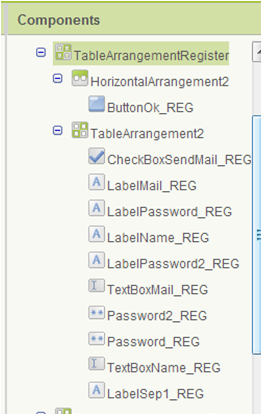 |
This is the window where the user registers into the app. After introducing its identification data and pressing the Ok button a new record is stored in the database (validating previously that the username does not already exist).
◾ LabelName_REG, LabelPassword_REG, LabelPassword2_REG, LabelMail_REG: Identifying labels. The prefix “*” indicates mandatory fields (this will be validated by code)
◾ TextboxName_REG, Password_REG, Password2_REG, TextboxMail_REG: The fields where the user enters his information
◾ CheckBoxSendMail_REG: Indicator of whether the user will receive email notifications
◾ ButtonOk_REG: Stores data and closes the screen
NOTE: There is no “Cancel” button, because Android style guide orients towards using the device back button instead
TableArrangementSendPwd
 |  |
This window notifies about the password stored for a given username. If user’s email is informed the notification is sent to that address. Otherwise it’s shown as a screen message.
◾ LabelName_SEND, TextboxName_SEND, ButtonOK_SEND: No secrets
◾ LabelSep1_SEND: Spacer label to leave some space at the top. Inform the required height
◾ HiddenMail_SEND, HiddenPassword_SEND: These are auxiliary fields used to store the mail and password retrieved. They MUST NOT be shown in the screen, so mark the “Visibility” attribute as Hidden
TableArrangementGoogle
 |  |
This is the window that shows the Google login interface. All the magic is performed by code, so it has simply two components:
◾ TableArrangementGoogle: Used to achieve a full screen layout. Inform Height and Width to Fill parent
◾ WebViewer1: The component used to show Google’s web interface. Inform Height and Width to Fill parent
◾ TableArrangementGoogle: Used to achieve a full screen layout. Inform Height and Width to Fill parent
◾ WebViewer1: The component used to show Google’s web interface. Inform Height and Width to Fill parent
TableArrangementHelp
 |  |
This is the window that appears when the user presses the “Help button”. We reuse the same interface for all windows despite each one has a specific text help. This is achieved by code (i.e. the right text is loaded according to the window from which the help is invoked).
Therefore the window has a general structure consisting of a header (VerticalArrangement3), a body (VerticalArrangement2) and a footer (LabelLogo). After creating these arrangements we can simply drag into them the appropriate labels. In our case:
◾ LabelHead: The title. Mark the Bold attribute and inform a slightly bigger text size (e.g. 16).
◾ LabelHeadSpacer: Just a spacer. Leave the text blank and inform a small height (e.g. 10)
◾ LabelHelp1, LabelHelp2, LabelHelp3, LabelHelp4: The labels that will contain the help body. Place one above the other in the VerticalArrangement2 and inform their width as Fill parent.
◾ LabelHelpLink: A text that can show a web address as the last line of the text help. Inform the attribute TextColor = blue.
NOTE: This label looks like a hyperlink but it has no real behavior. To provide a real hyperlink we should use a button instead of a label, add a WebViewer component and program the button click event to open the web viewer with the address specified in the button label. This is implemented in version 2.
◾ LabelLogo: A logo to be shown in the footer. You’ll probably prefer to use an image rather than a label. In this case you’ll probably require a HorizontalArrangement to center the image
Other Components
Finally here are the non-visual components
 | ◾ TinyDB1: Used to store locally the username and password entered by the user, in order to offer them as a defaul next time ◾ TinyWebDB_LOGIN: Reads information from the user’s database in order to validate the credentials ◾ TinyWebDB_SEND: Reads user’s mail and password from the database ◾ TinyWebDB_REG: Reads and writes user’s information the database ◾ TinyWebDB_PROFILE:er1: Similar TinyWebDB_REG but with different behaviour. Actually we could have used a unique TinyWebDB for the whole screen but it’s separated for clarity sake ◾ WebGetToken, WebGetGoogle, ActivityStarter, Clock1: Used for the google login, as explained in the tutorial How to redirect to the Google login) ◾ WebMailSend: Used to send mails (the service is provided via a Web component as explained in the tutorial How to send direct mails) ◾ Notifier1: Used to show notifications ◾ SoundClick: Plays a sound when a button is pressed |
NOTE: By default the ServiceURL attribute of all TinyWebDB components will be set to appinvtinywebdb.appspot.com. This will work but it’s not a good practice for the final application. You should set up a specific service for tinywebdb as explained in the tutorial Creating a Custom TinyWebDB Service and then inform the service URL to all the TinyWebDB components
Main screen
Finally here is the template’s second screen, i.e. the one that will be opened when user presses any menu option. If you use this template in a real app, this is the screen that will necessarily have to be adapted.
 |  |
At the level of this template we simply include the header bar (which shows the logged user), a generic help window and a label (which shows the selected option). Both the header bar and the help window have the same interface we’ve already seen for Screen1 so we’re not going to explain them again.
And that’s all regarding the graphical interface. The app is designed and now it’s time to program its behavior. This will be explained in part 2.
블로그 관리자가 댓글을 삭제했습니다.
답글삭제