Does anyone have experience drawing a donut graph using canvas?
I am trying to plot a ratio in terms of a circle. For example. values of 1 and 3, would mean a donut with 4 sections of which 3 are shaded in blue and 1 in red.
This can probably be done using Google Charts API but want to enquire if it is possible using Canvas draw circle?
I am trying to plot a ratio in terms of a circle. For example. values of 1 and 3, would mean a donut with 4 sections of which 3 are shaded in blue and 1 in red.
This can probably be done using Google Charts API but want to enquire if it is possible using Canvas draw circle?
--
A donut graph is going to be difficult. Impossible? I do not think so however this will be a lot of work and will probably draw slowly.
Draws a circle (filled in) at the given coordinates on the canvas, with the given radius.
Draws a line between the given coordinates on the canvas.
Sets the color of the specified point. This differs from DrawPoint by having an argument for color.
Here are the tools Canvas has:
Methods
Clear()- Clears anything drawn on this Canvas but not any background color or image.
DrawCircle(number x, number y, number r)- Draws a circle (filled in) at the given coordinates on the canvas, with the given radius.
DrawLine(number x1, number y1, number x2, number y2)- Draws a line between the given coordinates on the canvas.
DrawPoint(number x, number y)- Draws a point at the given coordinates on the canvas.
DrawText(text text, number x, number y)- Draws the specified text relative to the specified coordinates using the values of the FontSize and TextAlignment properties.
DrawTextAtAngle(text text, number x, number y, number angle)- Draws the specified text starting at the specified coordinates at the specified angle using the values of the FontSize and TextAlignment properties.
number GetBackgroundPixelColor(number x, number y)- Gets the color of the specified point. This includes the background and any drawn points, lines, or circles but not sprites.
number GetPixelColor(number x, number y)- Gets the color of the specified point.
text Save()- Saves a picture of this Canvas to the device's external storage. If an error occurs, the Screen's ErrorOccurred event will be called.
text SaveAs(text fileName)- Saves a picture of this Canvas to the device's external storage in the file named fileName. fileName must end with one of .jpg, .jpeg, or .png, which determines the file type.
SetBackgroundPixelColor(number x, number y, number color)- Sets the color of the specified point. This differs from DrawPoint by having an argument for color.
You can draw a circle, but it is filled in. So, you have to draw two circles, one larger than the other.
DrawCircle(number x, number y, number r)
DrawCircle(250,250, 100)
DrawCircle(250,250, 50)
then you have to partition the circle(s) into four pieces.
Trig comes to the rescue.
You can use this to partition:
DrawLine(number x1, number y1, number x2, number y2)
The first line is easy DrawLine(250 - 50, 250, 250 - 100, 250) perhaps (because you will not draw the line from 250,250 but the circumffereance of the the smaller circle, so 250 + or perhaps 250- on the x axis.
then you have to calculate where to draw the next three lines. You will need to find a point on the circumference of both the smaller and larger circles that represents the first 'pie slice'. Here is where you will need a trig operation in you Math blocks. Your next line is like your second; draw it a position of an arc representing the first piece slice plus the arc of the second perhaps. Do it one more time.
Now you have to fill in all the pixels of each segment (actually truncated pie slices).
You have a single tool to fill in the slices:
SetBackgroundPixelColor(number x, number y, number color)
or perhaps use the DrawPoint and change the DrawPoint.Color
Now, you may have to calculate the position of every pixel within each segment ... possibly using a technique similar to drawing the segments themselves.
I do not think you want to do this, but if you do, or find a better way, please post the solution and your experience.
--
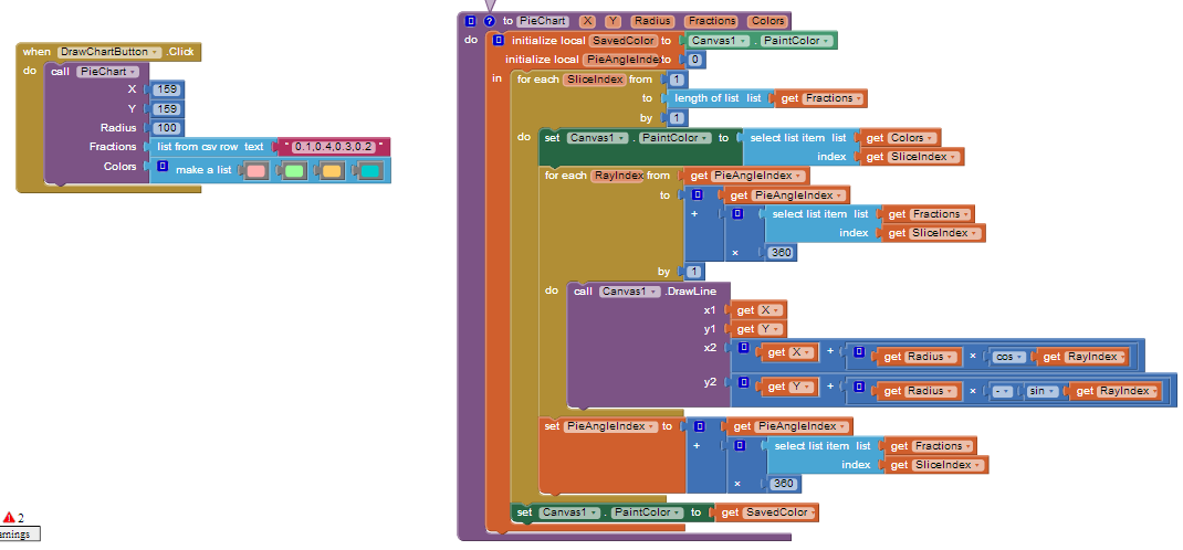
Here is a possible solution based on the ability for multiple rays to be drawn from the center of a circle to it's perimeter to fill each sector/wedge of a circle.

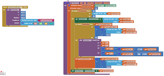
Two lists are passed to the procedure, one contains decimal values for the size of each slice of the pie and the other contains the color values for each slice.
I am trying to plot a ratio in terms of a circle. For example. values of 1 and 3, would mean a donut with 4 sections of which 3 are shaded in blue and 1 in red.
For your example you would attach two lists of 4 items to the procedure:
0.25.0.25,0.25,0.25)
lightblue,blue,darkblue,red
But you could modify the procedure to take your values instead
--
Thanks Steve and Scott for your replies. It has given me some really good pointers (including the realization that I need to use trig functions).
Thanks again!
Thanks again!
--
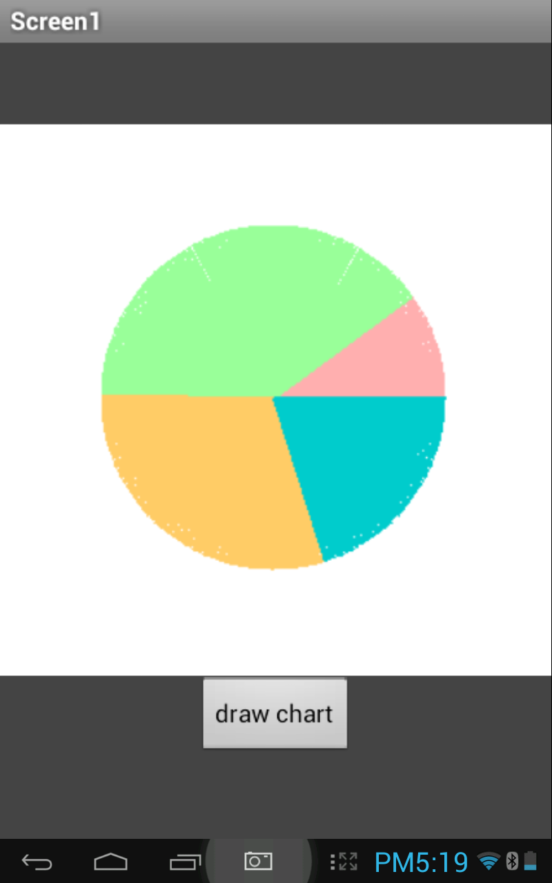
...and here is the Donut graph ecivon if you have not already figured it out. The key is Scott's Pie Chart , have fun.
Simple, when using Scott's Pie chart algorithm.... just add a white circle in the center of the pie chart.
@Scott Nice, 'easier' than I thought, you spent a lot of time figuring that out. .... a post for Tips and Tricks?
--
Thanks, SteveJG -- nice, simple solution :)

I would add that for larger charts the wedge colors may not fill completely so decreasing the 'by' value should fill better, but it will take longer to draw the chart.
(0.5 would likely take twice as long to draw)

--
댓글 없음:
댓글 쓰기