This tutorial demonstrates how to develop a Photo Booth app. You’ll build an app that let’s you take pictures, assign pictures to canvases and share pictures via email.
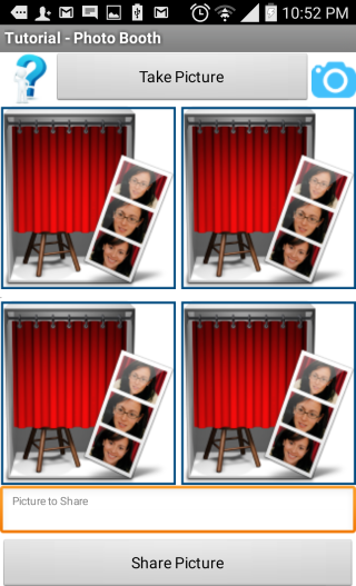
The completed app will look like the figure below:


Adding Behaviors to Components
Adding the Click event to btnHelp Button component

Taking pictures and saving pictures into a Canvas
Users will be able to click on btnTakePicture button or the btnCamera button to start invoking the internal camera app of the device. There are 4 canvas components on the screen layout and they are named Canvas1 through Canvas4. Each time a picture is taken, we will set the background of one of the canvas components onto the new picture. The 1st picture will be set as background of Canvas1 and 2nd picture will be set as background of Canvas2 and etc. This will continue through for all four canvas components and will then rotate back to 1st canvas. To keep track of which canvas should be used, we use a global variable which will be incremented for every time a picture is taken.
Initializing global variable: From the Built-in Variables drawer, select “initialize global name to” block. Change its name to canvasNum. Next, from Math drawer select “0” number block and plug into socket of the new variable block:

Starting the camera: When either btnTakePicture or btnCamera buttons are clicked, we will use their associated Click event handler to capture the event and start the camera using Camera1.TakePicture block:

Saving pictures as canvas backgrounds: After a picture is taken and accepted, the Camera.AfterPicture event will be triggered. In this event, the global variable canvasNum is incremented by 1. This will allow us to rotate the canvas and save, as background, to Canvas1 through Canvas4. When canvasNum exceeds 4, we set it back to 1 so that we can save the picture back to Canvas1 background. To keep the code modularized, we use a procedure that can accept an image as argument (the full image path of the just-taken picture).
The blocks in the procedure will need to inspect the value of our global index, canvasNum. If this value is 1, then we set the designated image (path) to be the background of Canvas1, if canvasNum is 2, we set it as the background of Canvas2, and so on. For purpose of this tutorial, we will use and if-then-else block. The completed code will look like figure below.
 The setPictureToCanvas procedure will need to be invoked after a picture is taken (Camera1.AfterPicture). In this event handler, we increment our global variable “canvasNum” by 1.

Next, we inspect if the resulting value is greater than 4. If so, we set it back to 1.


 If the path includes “file:///”, then we use “Sharing.ShareFileWithMessage” block and pass it the full image path and message-body.
Click here for a copy of this document on which you can make comments and suggest edits.
Photo Booth Tutorial App
Hossein Amerkashi - April 28, 2015
This tutorial demonstrates how to develop a Photo Booth app. You’ll build an app that lets you take pictures, assign pictures to canvases and share pictures via email. When a picture is taken, it will display in one of 4 canvases. When all canvases have been assigned pictures, the next picture assignment will rotate back to first canvas.
What You’ll Build
⦁ A photo booth app allowing you to:
⦁ Take pictures using camera
⦁ Save pictures onto a canvas
⦁ Display 4 pictures on 4 different canvases
⦁ Select a canvas picture
⦁ Share a canvas picture
The completed app will look like the figure below:
Before starting
Make sure your computer and your phone are set up to use App Inventor. Start a new project in the Designer window, and name it "PhotoBooth". Connect to Phone, and make sure the phone has started the showing the App Inventor project.
Placing the Initial Components
In the Designer, click on the Layout category to view all the App Inventor layout components. Select HorizontalArrangement layout and drop it onto designer viewer. From the properties panel set the Width of this layout to “Fill parent”.
Next, from “User Interface” drawer, select and drop three buttons into this layout and set their properties as follows:
Component
|
Rename to
|
Purpose
|
Properties
|
HorizontalArrangement
|
HorizontalArrangement1
|
Container for the three buttons
|
Width: Fill parent
|
Button
|
btnHelp
|
Help button
|
Image: help.png
Text: none
|
Button
|
btnTakePicture
|
To take picture
|
Text: Take Picture
Width: Fill parent
|
Button
|
btnCamera
|
To take picture
|
Image: camera.png
Text: none
|
The completed arrangement should look like figure below:
Select and drop another HorizontalArrangment component below HorizontalArrangement1. Select components as shown below and set their properties as indicated:
Component
|
Rename to
|
Purpose
|
Properties
|
HorizontalArrangement
|
HorizontalArrangement2
|
Container for below components
|
Width: Fill parent
|
Canvas
|
Canvas1
|
Display camera picture
|
BackgroundImage: photobooth.png
Width: Fill parent
|
Label
|
lblFiller1
|
Used as filler (gap)
|
Text: none
Width 5
|
Canvas
|
Canvas2
|
Display camera picture
|
BackgroundImage: photobooth.png
Width: Fill parent
|
This arrangement should look like figure below:
Select and drop another HorizontalArrangment component below HorizontalArrangement2. Select components as shown below and set their properties as indicated:
Component
|
Rename to
|
Purpose
|
Properties
|
HorizontalArrangement
|
HorizontalArrangement3
|
Container for below components
|
Width: Fill parent
|
Canvas
|
Canvas3
|
Display camera picture
|
BackgroundImage: photobooth.png
Width: Fill parent
|
Label
|
lblFiller2
|
Used as filler (gap)
|
Text: none
Width 5
|
Canvas
|
Canvas4
|
Display camera picture
|
BackgroundImage: photobooth.png
Width: Fill parent
|
Select and drop a TextBox component below HorizontalArrangment3. Select and drop Button below this TextBox and set their properties as below::
Component
|
Rename to
|
Purpose
|
Properties
|
TextBox
|
txtPictureToShare
|
For debug purpose only. Used to show image name
|
Width: Fill parent
Text: none
Hint: Picture to Share
Enabled: false
|
Button
|
btnSharePicture
|
To start the sharing process
|
Width: Fill parent
Text: Share Picture
|
This arrangement should look like figure below:
Finally, we will need 3 non-visible components:
- Camera - Media drawer - used to take picture - Sensor
- Notifier - User Interface drawer - to display informative information
- Sharing -Social drawer - to share image via email
Adding Behaviors to Components
You have added Button, Canvas, TextBox and non-visible components. Its now time to define how the components behave.
Adding the Click event to btnHelp Button component
This button is used to display help information using Notifier component. Once this button is tapped, we will display usage-information. Since our help-text is long, we use a “join” block (Text drawer) to join our help-text. Note that “join” has a mutator icon, that lets you add additional slots for more input to join. For a complete explanation of mutators, refer to documentation HERE.
Taking pictures and saving pictures into a Canvas
Users will be able to click on btnTakePicture button or the btnCamera button to start invoking the internal camera app of the device. There are 4 canvas components on the screen layout and they are named Canvas1 through Canvas4. Each time a picture is taken, we will set the background of one of the canvas components onto the new picture. The 1st picture will be set as background of Canvas1 and 2nd picture will be set as background of Canvas2 and etc. This will continue through for all four canvas components and will then rotate back to 1st canvas. To keep track of which canvas should be used, we use a global variable which will be incremented for every time a picture is taken.
Initializing global variable: From the Built-in Variables drawer, select “initialize global name to” block. Change its name to canvasNum. Next, from Math drawer select “0” number block and plug into socket of the new variable block:
Starting the camera: When either btnTakePicture or btnCamera buttons are clicked, we will use their associated Click event handler to capture the event and start the camera using Camera1.TakePicture block:
Saving pictures as canvas backgrounds: After a picture is taken and accepted, the Camera.AfterPicture event will be triggered. In this event, the global variable canvasNum is incremented by 1. This will allow us to rotate the canvas and save, as background, to Canvas1 through Canvas4. When canvasNum exceeds 4, we set it back to 1 so that we can save the picture back to Canvas1 background. To keep the code modularized, we use a procedure that can accept an image as argument (the full image path of the just-taken picture).
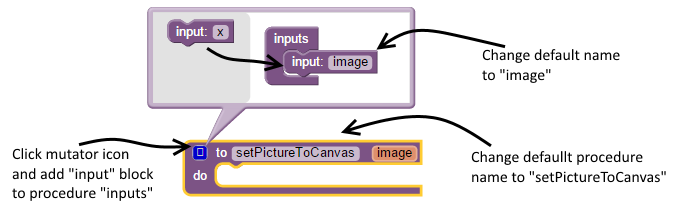
Using the Built-in Procedures drawer, select “Procedure” block and add into blocks-editor viewer. The procedure back has a mutator. The figure below shows how to use the mutator to construct the required procedure setPictureToCanvas.
The blocks in the procedure will need to inspect the value of our global index, canvasNum. If this value is 1, then we set the designated image (path) to be the background of Canvas1, if canvasNum is 2, we set it as the background of Canvas2, and so on. For purpose of this tutorial, we will use and if-then-else block. The completed code will look like figure below.
Next, we inspect if the resulting value is greater than 4. If so, we set it back to 1.
The Camera.AfterPicture event handler passes a parameter called “image” which is the full path of the picture that was just taken. Knowing this, we invoke our “setPictureToCanvas” procedure passing this “image” parameter to it. The full block-code for Camera1.AfterPicture is shown in figure below:
Now, every time a picture is taken, it will display in Canvas1, then Canvas2, then Canvas3, then Canvas4 and back to will reset back to Canvas1.
Sharing pictures: For an additional feature of the photo booth app, we will allow users to share a picture by selecting it (via tapping on a canvas) and then tapping on the “Share Picture” button. To capture the canvas touch events, we use Canvas.Touched event handler. This event handler is triggered every time the canvas is touched. Canvas also includes a block property called Canvas.BackgroundImage which returns the full image-path of the image that is assigned to its background. We retrieve the image-path and display it in our TextBox (txtPictureToShare):
The completed block-code for handling the touch events on all 4 canvas is shown in figure below. Note that the code for all 4 canvases are same with exception of canvas name:
The final functionality to implement is to share the picture via Sharing component. When btnSharePicture is clicked, we need to check if a valid picture was selected. A valid picture would mean that its full-path starts-with “file:///”. For this, we use the “contains” block in the Built-in Text drawer.
If the path is invalid (doesn’t include “file:///”, we display an alert message using “Notifier.ShowAlert” block.
Tutorial Version: App Inventor 2
Tutorial Difficulty: Intermediate
Tutorial Type: Camera
Tutorial Version: App Inventor 2
Tutorial Difficulty: Intermediate
Tutorial Type: Camera
댓글 없음:
댓글 쓰기